Saturday, January 22, 2011

EVENT REVIEW

Applied Graphic Design "A" EVENT REVIEW
Pine Street Creative Arts Centre
Innovative and Progressive Community Arts


Introduction
I went an annual Tutors’ Exhibition and I can find the witness first hand the creative skills of the artists which aims to encourage, stimulate and promote local arts and cultural activities. The exhibition feature an inspiring display of beautiful artworks across the disciplines of ceramics, printmaking, silver jewellery, sculpture, painting, drawing, stencil art and more. The exhibition held the City of Sydney's Community Art Centre, situated in the heart of Sydney’s inner west.
When I was in the gallery, I found the atmosphere of the creative arts. From the entrance I saw lecture room and old style building it is full with feeling of artists place. And I surprised by the fact I can easily find that the full of the impressive arts from my area.
In my point of view, every art works has not giving a meaning directly. It contains inside world like potential meaning not the viewing only, which provided particular images or objects with esoteric attractions. By looking more closely at the exhibition, it is possible to understand how the organizers of the exhibition chose to see creative art. From the pine art gallery, I can identify what the artwork is.

Art works review

When I see this work, I did not realize what it is. It looks like a wood shape instrument. Actually, it is a kind of expression that the cow is new born from the egg which called ‘origin 5’. It looks strange, ridiculous and deconstructs the common sense, but in my opinion, it is another part of aspect of the art. So it would be an expression of you’re idea using on the other way that represent behind meaning of the art that you think. This art work is quiet interesting to me it used a wood material then make a looking like a cracked egg which is born wood cow from the wood egg.It looks funny but I thought it has a different meaning. It analyzes the artwork in a different way that makes me think the art is not always the same. It is a progressive and has developed, changed to think what the artwork is.


This is also interesting work to me to used paper to describe the party which is called ‘festival’.
In my point of view, mainly, it use the different color balance with the straight horizontal line patternand illustrate the people which is draft style people shadow briefly and background color to make me feel that it is a night club atmosphere, there is the yellow and blue color that is a light on the stage. Every people is described with the close distance within ‘intimate zone’ which focus on social relationship / communication with other people.
It is not a painting, however I could find the some style of the pop art from this artwork.


First time I saw this work, I just felt that it looks like a 3-dimensional cartoon then I understand the contents and feel friendly mind to this artwork.
The character of the art, which called “Bunkwaa”, is very cute and funny so it recalls me the child-hood. When I see it, I did not feel any other mind; I was only concentrated to the point of the child’s view. So I think it is a friendly cartoon and includes me to the world of the kids.
I like how the paintings can depict the colors so realistically, and how they can give some kind of feeling to the audience, just by looking at it. It’s like the painting were alive and could move by itself. The reason why I feel it like live picture is from the 3D, perhaps.
I saw a lot of characterized animation pieces from Bunkwaa, certain view of their respective aspect include the viewer’s mind, which means intimate zone.
In addition, the artist only use the cardboard to make this work, even the TV frame is also made by same material.
So I just felt it is like an eco-friendly work to recycle the rubbish.
Even it made by the cardboard, it can show a dynamic art not only using the TV animation but also using the cardboard that uses 3 pattern of the color and highlighter pen that make us feel like it is a 3-dimensional works. In my opinion, it includes the entire element of Multimedia works.


Benefit from the pine street art gallery

First time, when I watched the art works in the gallery I could not define definitely about the art work is, that is an art or not. However, I try to understand the art work.
In my opinion, there is a way to understand the picture that is depended on the spectator's point of view. Perhaps, it is a communication about the picture between spectators and artist to understand.
Some people believe that they should visit the art gallery, which is famous and well-known place only.However, I prefer to stay the place where is quiet and tidy, which is not crowded with many people. In this reason why pine street art gallery is the most interesting art gallery to me. I enjoyed the pine street art gallery the most.I think visiting the art gallery is the meaning of the changing and expression of world's artist’s point of view; using the way to paint the light, color.
What is the masterpiece? Perhaps, it is a way to make a value of new stream that is the representative of the real worldview.
It is the great learning value understanding the culture. Because art is a beautiful part of our history so I think, visiting an art gallery is a journey back through time and into the creative minds that help to learn our culture which is the main theme of expression in the art.
From the gallery, I could find the way to understand creative arts and that explain me to learn what is the creative art is.Although it has brought complex meaning to me, but it afford me to make a new point of view to the art form away from the traditional way to break the stereotypes at that time art.

Monday, January 3, 2011

Pop Art, My works

I want to describe it as a minimal work.
so It was illustrated and abstracted cloud on picture that only used few color to describe.


In my opinion, pop art mostly represent the mass culture.
So, I just followed the way to describe different color balance
such as TV scene,magazine and advertisement.

Pop Art


The term "Pop Art" emerged from the pen of English critic Lawrence Alloway in the late 1950s to describe what he viewed as a contemporary attitudinal shift in subject matter and techniques of art. Instead of rarefied content like Bible stories, myths, or legends that had traditionally been the subjects of Fine Art, Pop Art saw the increasing spread of corporate marketing through western culture as inspiration to take commerce itself as the subject of artistic scrutiny — and that it was every bit as artistically worthy.

Beginning in England in the mid-1950s and America in early 1960s, Pop Art focused on everyday objects rendered through an adoption of commercial art techniques. In so doing, artists availed themselves of images and ideas culled from popular culture — i.e., movies, comic books, advertising, and especially, television — faithfully reproduced in all their mass produced glory. By making use of what had been dismissed as "kitsch" by the art establishment, Pop artists whose works were displayed in museums effectively thumbed their collective noses at the distinctions between "highbrow" and "lowbrow" art.

Although Andy Warhol was not the first artist to mine advertising for art, he remains the best known practitioner. In paintings like "200 Campbell's Soup Cans" (1962) and "Marilyn Monroe Diptych" (1962), Warhol tried to elevate mechanical reproduction to Fine Art status, enraging some critics even as buyers eagerly bought up his work. Similarly, Roy Lichtenstein turned to the comic strips of his youth to inspire his garishly bright art depicting sensational action or drama formed by the same kind of enlarged printer's dots used by cheap newsprint, reaping great success in the process.

Other artists like Robert Rauschenberg and Richard Hamilton formed collages out of pre-existing print images which took on added subtexts of ironic or sardonic meaning when assembled together. Muralist James Rosenquist created billboard-sized works crammed with consumer goods as a comment on media overload, and sculptor Claes Oldenburg sought to deprive everyday objects of their function, crafting soft vinyl toilets and humongous hot water bottles that could have no practical use.

Designed of and for the masses, though executed by an elite, Pop Art saw its design aesthetic dissolve after the late 1960s. It was at once eclipsed by Abstract Expressionism and assimilated by the same corporate marketing sources it had used for creative fuel.


POP art & My Opinion

History
Mid 1950s in Britain and
in the late 1950s in the United States,
pop art movement has emerged.
The attitudes of pop art is a challenging to the traditional art that use of the mass culture.
pop art is one of the post modern art that describe popular culture in the world at the moment.
It use the simple image and it is similar to Dada.

Meaning
It is also related with the abstract art using the meaning of irony.
It follows the aspects of mass culture( advertising, comic books)
So this is aimed to oppose to the elitist culture.
Pop art just use the minimal elements that anyone can find it in any places with ironical meaning.

Technique
In my point of view, mainly, it use the different color balance with the same pictures pattern
and illustrate the anime which is japanes style cartoon and comics using the abstracted pictures to reproduce. It focused on commercial art techniques.

Thursday, December 9, 2010

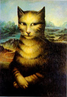
Dadaism - my work


WANTED


MONA LISA'S SCREAM


MONA LISA'S SCREAM 2

About Dadaism, my opinion


During world war I, people think what is the world is going.
So I think waste of World War i and the disorder influence the "dada" that left in its wake.

Dadaism against traditional painting and sculpture. And it can be an “anti-art” ideas and
attitudes as it is stated by anonymity.


It is a kind of joke that deconstruct the art work and it looks strange and ridiculous.

but in my opinion, It is an another part of stream of art.

Because I could find the trace its roots to Dada
Surrealism, Constructivism, Lettrism, THE BEAT POETS, Pop- and Op-Art, Conceptual Art, Minimalism, Punk Rock.

So It would be a expression of your opinion in the other way that represent behind meaning of the art that you think.

Dadaism

Dadaism
(1916-1924)
Raoul Hausmann Dadaism or Dada is a post-World War I cultural movement in visual art as well as literature (mainly poetry), theatre and graphic design. The movement was, among other things, a protest against the barbarism of the War and what Dadaists believed was an oppressive intellectual rigidity in both art and everyday society; its works were characterized by a deliberate irrationality and the rejection of the prevailing standards of art. It influenced later movements including Surrealism.

According to its proponents, Dada was not art; it was anti-art. For everything that art stood for, Dada was to represent the opposite. Where art was concerned with aesthetics, Dada ignored them. If art is to have at least an implicit or latent message, Dada strives to have no meaning--interpretation of Dada is dependent entirely on the viewer. If art is to appeal to sensibilities, Dada offends. Perhaps it is then ironic that Dada is an influential movement in Modern art. Dada became a commentary on art and the world, thus becoming art itself.

The artists of the Dada movement had become disillusioned by art, art history and history in general. Many of them were veterans of World War I and had grown cynical of humanity after seeing what men were capable of doing to each other on the battlefields of Europe. Thus they became attracted to a nihilistic view of the world (they thought that nothing mankind had achieved was worthwhile, not even art), and created art in which chance and randomness formed the basis of creation. The basis of Dada is nonsense. With the order of the world destroyed by World War I, Dada was a way to express the confusion that was felt by many people as their world was turned upside down.